Fair use: a guide for artists

Published: March 17, 2015

This may be useful to web designers:

The College Art Association has created a Code of Best Practices in Fair Use for the Visual Arts, helping the field of people who make, study and showcase the visual arts figure out how to make a fair use call. The field is abuzz with the news, and even in related fields, word is out — musicians are interested, too.

Fair Use for the Visual Arts

Via Boing Boing.

Spirit Monster

Published: April 21, 2013

I recently worked on the Spirit Monster web site.

The site uses jCart, which I modified to send an email (rather than sending the user to PayPal).

New tools for web design and development: January 2013

Published: February 19, 2013

Netmagazine recently posted reviews of new tools for web development:

  • Parsley.js
  • Are You a Human?
  • X-editable
  • Dillinger
  • Character-Code.com
  • Malihu jQuery Custom Scroller 2.3
  • One Div
  • Zigg.be Alpha
  • RubyJS
  • BaconJS

See the  Netmagazine article for reviews and more.


Responsive web design

Published: February 6, 2013

I redesigned karljones.com using responsive web design* principles, with three different layouts based on browser width:

  • Desktop: display two columns, main and sidebar
  • Tablet: display one column, collapse sidebar below main
  • Mobile phone: display one column, hide sidebar

Each of the three sizes also has CSS for different font sizes, the idea being a page that reshapes itself to look good on any given device.

Try it: on a desktop browser, watch the sidebar collapse into the main column, then disappear altogether, as you drag the browser narrower. Better yet, compare a desktop browser and a mobile device browser, see the difference.

This is a start — an improvement on life before media queries — but only an imperfect and temporary solution to a long-standing (and fast-evolving) problem.

The idea of “write once, display anywhere” asks too much of media queries and CSS, much the same way that the Holy Grail asks too much of knights-errant.

What we really desire, of course, is a Brass Head — an “automaton … reputed to be able to answer any question.”

Alas, “reputed” is ever the rub, and answering “any question” exceeds our current technology. “Indistinguishable from magic” will have to wait for another day.

–KJ


* By “responsive web design” (a fashionable term, open to some degree of interpretation) I mean media queries and other CSS rules. See also Wikipedia:

Wee Nudge: teach your clients about web design

Published: November 16, 2012

Wee Nudge provides a variety of links, sorted by categories, intended to help you teach your clients about web design.

Wee NudgeTrying to convince a client not to squeeze everything above the fold? Is your whitespace filling up fast? We’ve collected a variety of articles on some sticky web subjects that might just help you make your point. Send your client to one of our topic pages for a quick intro, some links and a wee nudge in the right direction.

weenudge.com/

Learning HTML Through a Board Game

Published: October 8, 2012

chtemele

cHTeMeLe is a board game about HTML @ geek.com

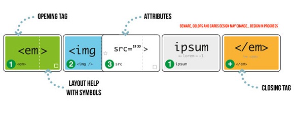
cHTeMeLe is a board game about writing HTML5 code. In cHTeMeLe, players endorse their favorite web browser (Firefox, Safari, Chrome, Opera, or IE) and then score points by correctly laying out HTML tags, while also trying to bug or crash their opponents’ code. From the article: ‘Despite cHTeMeLe’s technical theme, its developers claim you don’t need any web programming experience to play. The game takes web design standards and boils them down into game rules that even children can learn. To help less technical players keep everything straight, the tag cards use syntax highlighting that different parts of code have unique colors — just like an Integrated Developer Environment. No one is going to completely pick up HTML5 purely by playing cHTeMeLe, but it does have some educational value for understanding basic tags and how they fit together.

[Via Slashdot]

“The bad news is that cHTeMeLe is only in French for the time being, so many English speakers will have to wait for a translation of the rule book — which, of course, is called ReadMe_fr. Fortunately, the developers have followed in Cards Against Humanity’s footsteps by licensing the game under Creative Commons and making it available for download and printing. So once cHTeMeLe supports other languages, it should be easy to make your own copy.”

Responsive Web Design: Layouts and Media Queries

Published: April 23, 2012

“Responsive Web Design indicates that a web site is crafted to use W3C CSS3 media queries with fluid proportion-based grids, to adapt the layout to the viewing environment, and probably also flexible images.” [Source: Wikipedia.]

A responsive website is a website that will respond and adapt to the user’s behavior and screen size. The idea is to resize and reorder the design, adapt images, typography, columns, etc., based on screen-browser size, resolution and orientation instead of providing each device a specific website.

Stéphanie Walter

Responsive Web Design

Advertising and Web Design Agency website examples

Published: January 11, 2012

Examples of advertising and design agency websites:

Advertising and Web Design Agencies always portray themselves as the best when it comes to creativity. While doing so, they are required to keep their own websites really creative and beautiful. Clients always see the agency websites to see how creative these companies could get. The website has to be such that it could attract new clients, navigation should be simple. Every web agency needs to understand one simple mantra that first impression matters a lot in this business.

Link

Content Prototyping in Responsive Web Design

Published: September 27, 2011

You should gather and produce content prior to starting the design, says Ben Callahan, and you should consider using a content prototype to organize the content:

A content prototype is an HTML-and-CSS-based fluid-grid prototype, consisting of layout and typography, that consists of the project’s actual content. Its greatest usefulness may be in determining where to apply media queries to make the Web design responsive.

For centuries, we have shaped our layouts and typefaces according to the meaning of the content. This has traditionally been done on fixed-width pages. We have inherited a fixed-width mentality in designing for the Web, when in fact the Web is not fixed-width. Users come to our websites for content. We should strive to present this content in the most appropriate and readable way possible.

Ben Callahan @ Smashing Magazine

23 Examples of Screenshots in Web Design

Published: September 19, 2011

A screenshot a digital image of a computer display, like a photograph of what you see on a monitor.

You might make screenshots for a variety of reasons, not least of which is the desire to impress potential clients with pictures of web sites you have created.

For inspiration, see: 23 Examples of Screenshots in Web Design.